Introduction:
In fashion designing industry, Basic concept of color is the most essential elements of design for clothing. Without color dress design is totally incomplete. Choosing colors is fun. Every fashion designer has to more option to choosing an effective color scheme and simply picking the colors for appeal design. He gets more knowledge about latest fashion color on dress and then tries to knowing what consumer like. Basic concepts of colors are most essential to know the use of color in our daily life. It is impossible to imagine a life without color on dress.

Definition of Color:
Color is the by product of the spectrum of light, as it is reflected or absorbed, as received by the human eye and processed by the human brain.
In discussing color in detail, there are also several terms used to describe color that you should understand.
- Hue: A pure, unadulterated color.
- Shade: A hue to which black has been added. Ex. purple + black = eggplant.
- Tint: A hue to which white has been added. Ex. purple + white = lavender.
- Tone: A hue to which grey has been added. This increases the subtlety of the color.
- Saturation: It eefers to the intensity of a color, or how strong/weak the color is.
- Chroma: It similar to saturation, it refers to the purity of a color, meaning there is no shading, tinting, or toning on the color.
- Value: It refers to how light or dark a color is (the lighter it is, the higher value it is).
Fashion Color Theory:
Fashion color theory is very important to any type of clothing, footwear, or accessory design you do. Knowledge of color theory is one of the most important tools you can have in your toolbox. Color can bring your designs to life or bring them down and leave you with unsold products. When designing apparel, it’s important to know which colors go well together, how to create those colors, and what color terminology the fashion industry uses.
Basic Color Concepts in Fashion Designing:
Color plays a fundamental role in dress design and is one of the most critical aspects of creating visually appealing and meaningful clothing. Understanding the basic concepts of color effects in dress design is essential for fashion designers, stylists, and anyone interested in creating or wearing clothing. Here, I will explain these concepts of color elaborately.
1. Color Wheel:
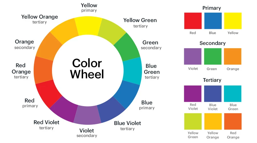
The color wheel is a visual representation of the color spectrum. It consists of primary colors (red, blue, and yellow), secondary colors (green, orange, and purple), and tertiary colors (a combination of a primary and a secondary color). The color wheel is the basis for understanding color relationships and combinations of color in dress design.
The color wheel is a vital tool for fashion designers and is something that you will reference to a lot when picking and deciding the color palette for your designs. The color wheel, which is a wheel, or a circle, shows the spectrum of colors and their relationship to each other. The standard number of colors on the wheel are 12, though some use up to 24 hues.

Types of color wheel:
a. Primary Colors
b. Secondary Colors
c. Tertiary colors
a. Primary Colors:
There are three Primary colors: RED, BLUE and YELLOW. Primary colors cannot be created by mixing other colors.
There are actually two types of primary colors:
i. Subtractive color
ii. Additive color
i. Subtractive color:
Subtractive colors are used in conjunction with reflex light. The subtractive colors are blue, red and yellow, (cyan, magenta and yellow where printing and coatings are concerned).
When all of the three subtractive primary colors were combined together, then they would produce black color.
Some examples where subtractive primary colors are used-
- Textiles
- Clothes
- Furnishings
- Printing
- Paints
- Colored coatings
ii. Additive color:
Additive colors that are obtained by emitted light. The additive primary colors are red, green and blue. When all of the three additive colors were combined together in the form of light, then they would produce white.
Some examples where additive primary colors are used-
- Television
- Theatrical lighting
- Computer monitors
2. Secondary Colors:
When two primary colors are mixing together then it’s called a secondary color. Secondary colors can only be created by mixing true primary colors. There are three types of secondary color. These are
Red + Yellow = Orange
Red + Blue = Purple
Yellow + Blue = Green
Orange, Purple and Green are secondary color when primary color is intermixed with secondary color.
3. Tertiary colors:
Tertiary colors are the combinations of primary and secondary colors. There are six tertiary colors;
Red + orange = Red orange
Yellow + orange = Yellow orange
Yellow + green = Yellow green
Blue + green = Blue green
Blue + violet = Blue violet
Red + violet = Red-violet
2. Color Schemes in fashion :
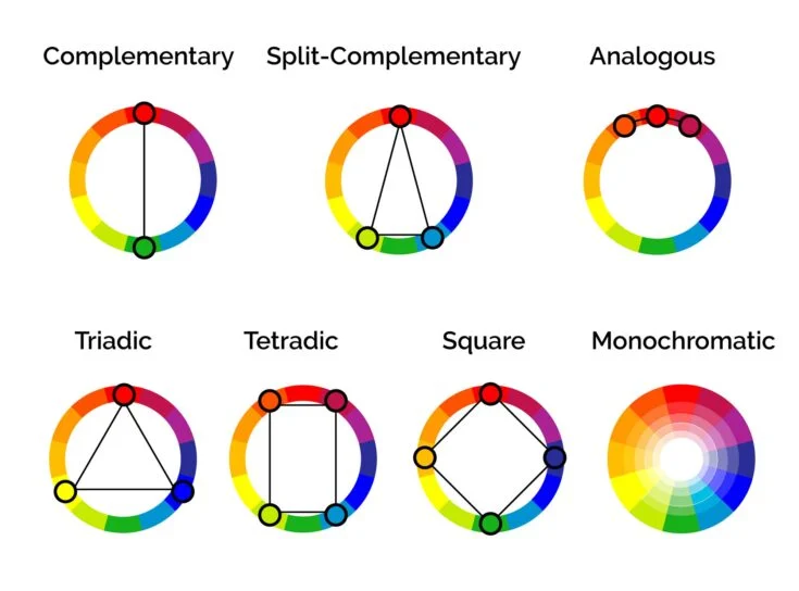
Color Schemes is achieved when colors are combined in a pleasing and balanced way. There are 9 common color schemes:
- The Triad Harmony colors: This is combination and three equidistant colours on the color wheel, e.g., red, yellow, blue or orange, green, violet.
- Analogous Colors: Colors that are adjacent to each other on the color wheel. For example, combining various shades of green and blue can create an analogous color scheme.
- Achromatic Colors: Achromatic colors are literally “Colours without colours”. It is also called as neutral colours. The color which comes under this colour scheme are black, white and grey.
- Complementary Colors: Colors that are directly opposite each other on the color wheel, such as red and green or blue and orange. Complementary colors create high contrast and can be visually striking.
- Split Complementary Colors: This scheme takes a color and instead of using the complementary color, you use the colors next to it. We know that red is green’s complement, so a split complementary scheme would be green, red-orange, and red-violet.
- Triadic: Three colors that are equally spaced around the color wheel. This creates a balanced and vibrant color scheme. For example, red, blue, and yellow can form a triadic color scheme.
- Tetradic: Also known as Square, this scheme uses four colors evenly spaced on the color wheel.
- Monochromatic colors: A single color in various shades and tints. Monochromatic color schemes are elegant and sophisticated and involve using only one color, such as different shades of blue.
- Warm and Cool Colors: Colors are often categorized as hot or cold. Warm colors (such as red, orange, and yellow) evoke energy, passion, and vibrancy. Cool colors (such as blue, green, and purple) convey calm, tranquility, and serenity. Understanding the emotional impact of bright and cool colors can guide designers in creating the desired atmosphere.

These schemes are helpful to know when you are choosing colors for your designs and communicating with others what you want.
3. Color Temperature:
Colors are often described in terms of temperature. Warm colors (red, orange, yellow) evoke feelings of warmth, energy, and excitement. Cool colors (blue, green, purple) are associated with calmness, serenity, and relaxation. Understanding color temperature is essential for conveying specific moods and emotions in dress design.
4. Color Psychology:
Concepts of colors can have psychological and emotional effects on individuals. For example:
- Red: Associated with passion, energy, and excitement. It can be used to create a bold and attention-grabbing look.
- Blue: Conveys a sense of calm, trust, and professionalism. It is often used in business attire.
- Yellow: Represents happiness, optimism, and youthfulness. It can add a cheerful and vibrant touch to clothing.
- Black: Symbolizes sophistication, power, and elegance. It’s a classic choice for formal and evening wear.
5. Cultural Significance:
Colors can have different meanings and cultural significance in various parts of the world. For example, white is associated with purity and weddings in many Western cultures, while it is a color of mourning in some Asian cultures. Be mindful of cultural considerations when designing clothing for a global audience.
6. Seasonal Color Analysis:
Fashion often follows seasonal color trends. Designers may choose specific color palettes for each season to reflect the mood and climate. For example, pastels are popular in spring, while rich, earthy tones may dominate in the fall.
7. Personal Color Analysis:
Personal color analysis considers an individual’s natural coloring, including skin tone, hair color, and eye color, to determine which colors are most flattering for them. This analysis helps people choose clothing colors that enhance their natural beauty.
8. Color in Fabric Selection:
Different fabrics can absorb and reflect colors differently. Satin may make colors appear more vibrant, while matte fabrics can make them appear subdued. Designers need to consider the type of fabric they’re using when selecting colors for a garment.
In conclusion, mastering the basic concepts of color in fashion design involves understanding color theory, harmony, temperature, psychology, cultural significance, and fabric interactions. Designers use these concepts to create clothing that conveys specific messages, moods, and aesthetics while considering the individual characteristics and preferences of the wearer.
You may also read:
References:
- Elements of Fashion and Apparel Design by Sumarhi, G.J
- https://bootcamp.uxdesign.cc/color-101-for-designers-d2c07eb8f4dd
- https://blog.makersvalley.net/basic-color-theory-for-fashion-designers

Editor of Fashion2Apparel. She is a fashion designer and ex-lecturer in Fashion Designing. She wants to spread fashion knowledge throughout the world.
Just wish to say your article is as surprising The clearness in your post is just cool and i could assume youre an expert on this subject Fine with your permission allow me to grab your RSS feed to keep updated with forthcoming post Thanks a million and please keep up the enjoyable work